Each year I wait (with baited breath) to learn what color has been selected by Pantone as their color of the year.
In 2022, I made a quilt based on the Periwinkle color…..
….and last year I used “Viva Magenta” as the basis for this quilt……
“Crossing Hemispheres”
So, I was excited when I saw that the 2024 color had been named……
However, I am having a hard time coming up with any excitement about using it!!
Right now it seems a rather bland and uninteresting color but that probably just means that I need to play with it some and add other colors that will highlight it.
OKAY….add that to my future quilts to-do list!!!
What would you do with this color?
.
……………………………………………………………………………..
Do you struggle to decide what to quilt in your blocks? If so, check out my FREE series…..
In this blog, I post stories about creativity, techniques, tools of the trade, and lots more about the wonderful art of quilting. If you are enjoying these posts, please subscribe to be notified of each new blog as it becomes available.
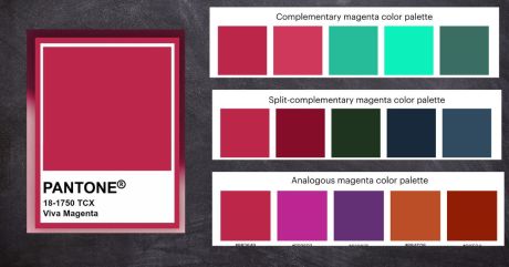
Yesterday I posted about the 2023 Pantone Color of the Year……
THEN, I started searching for color palettes that included this vivacious color!! Man, did I hit the jackpot!
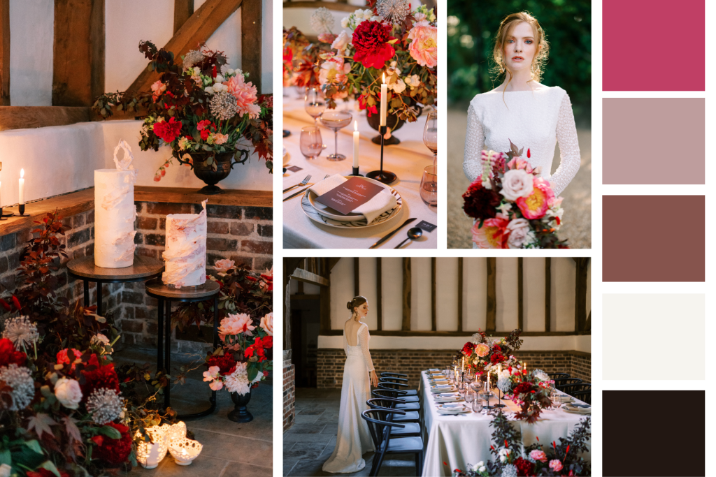
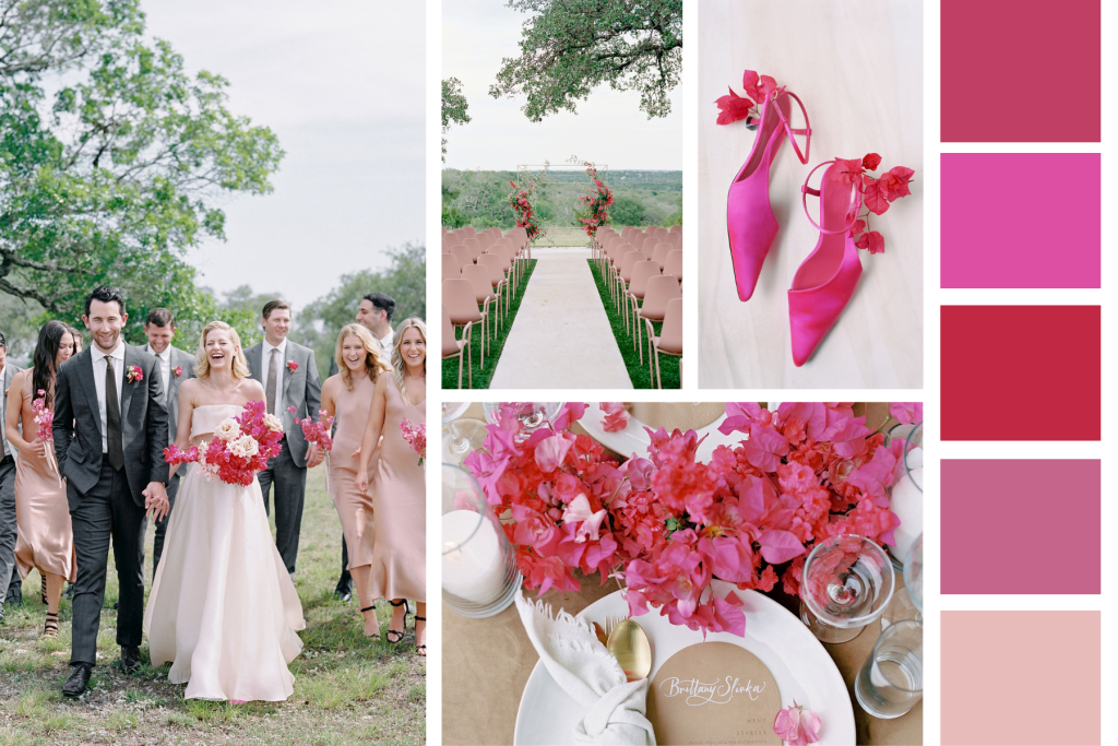
And if that weren’t enough, look at these wedding shoots that used Viva Magenta as well.
I especially love the Indian wedding!!
I am sure that you have noticed that in most cases, this color was used as a contrast or just to add that “POP” of color that we are always looking for!!
I think that I can enjoy using Viva Magenta in my projects, but probably NOT as the main color……we will see!!
In this blog, I post stories about creativity, techniques, tools of the trade, and lots more about the wonderful art of quilting. If you are enjoying these posts, please subscribe to be notified of each new blog as it becomes available.
Have you ever looked at fabric in the store and then had it look completely different at home?
The most likely culprit is the lighting, but it could also be because of the background that the fabric is sitting on.
Here is an example…..
I was pulling fabric for my “Olive Inspiration” block and took a photo to add to the blog. This was the photo……
No No No….that is NOT the color of my fabrics and I would NEVER eat an olive that was this color!!! Actually, I would never eat an olive anyway, but that is another story!!
I took a second photo, this time against a white background…..
YES….THAT is the true color of the fabric!!
So, if the camera sees the colors differently based on what the background is, would the eye not do the exact same thing??